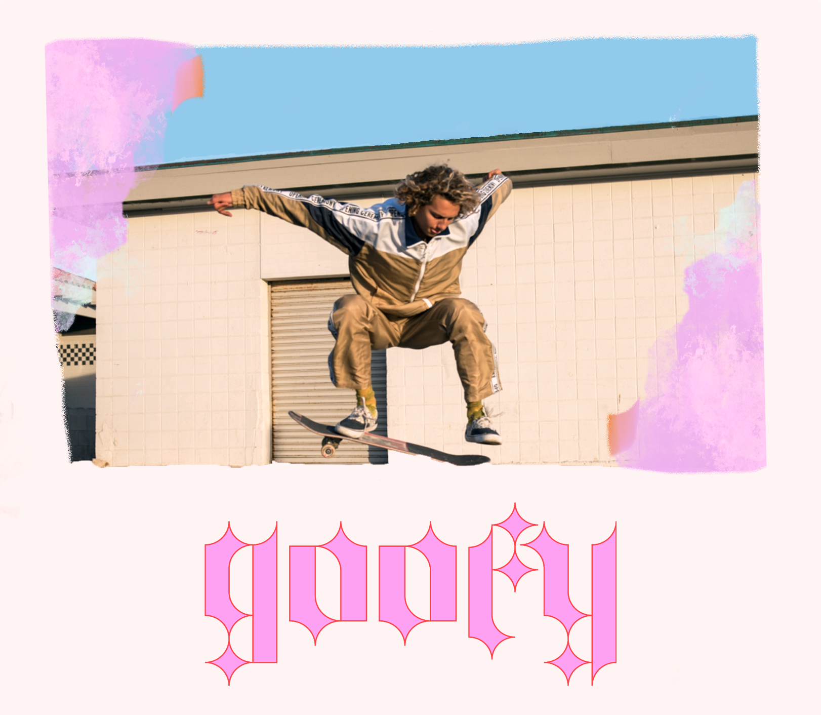
Goofy
A skate shop app with community-oriented features.
My role: UX, UI, Interaction, Motion, Visual, Product, and Graphic Designer
The Product
Goofy is a skate shop mobile app that allows users to find and save events in their area to help those who shop for merchandise find a way to connect to their local skater community.
The Research
I conducted a moderated usability study that included user personas, interviews, a competitive audit, and empathy maps to better understand the local skating community and their wants and needs in a skate shop mobile application. From the interviews I conducted, there was a great need to find skating communities through local skateboarding events.
Meet the Users
Problem statement:
Max is a developer who needs a way to connect with other skateboarders because he is having difficulty finding skateboarders and skateboarding events in his current city.
Problem statement:
Valerie is a young female skater who is looking for other female skaters to connect with. Valerie wants a skate shop that offers skateboard deck services along with community-orientated events.
user persona insights
1. Convenience: Users value the ability to easily search and save skateboarding events in their area without having to navigate to multiple websites or sources.
2. Community Connection: Skateboarders are often passionate about their sport and want to connect with other enthusiasts in their community. The app provides a way for users to find and attend events and connect with other skaters.
3. Local Event Discovery: Users appreciate the app’s ability to provide information about events they may not have known about otherwise, allowing them to discover new events and experiences.
4. Merchandise Information: Skateboarders often use events as an opportunity to purchase new gear and merchandise. The app’s ability to provide information about local events and the vendors attending them is a valuable feature for users.
5. User-Generated Content: Skaters value the ability to share information about events they have attended and to view information shared by other members of the community. This feature encourages users to actively engage with the app and contribute to the local skateboarding community.
6. Personalization: Users appreciate the ability to save events they are interested in, receive reminders, and create their own custom event lists. This feature helps users stay organized and keeps them up-to-date with the events they are most interested in attending.
7. Social Features: Skaters enjoy the ability to connect with others in their community, both online and in person. The app’s social features, such as the ability to share events with friends or join groups, help users find and connect with others who share their passion for skateboarding.
competitive audit
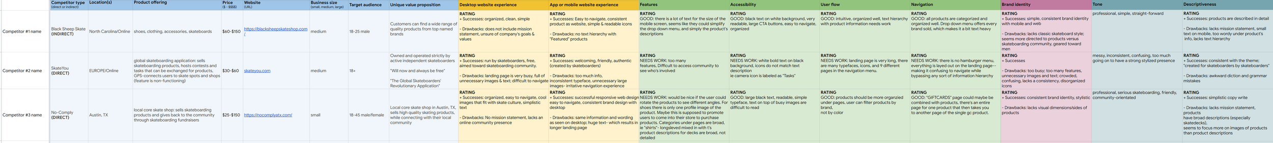
Competitive Audit — Skateboarding Apps
A review of leading skateboarding apps identified opportunities to strengthen brand consistency, community features, and navigation.
Key Insights
Design Consistency
Inconsistent visuals reduced clarity and brand cohesion.
Community Features
Limited options for connection and sharing hindered engagement.
Navigation Flow
Ambiguous paths made it hard for users to locate content efficiently.
Outcome
Improving visual consistency, integrating social features, and refining navigation will enhance engagement and overall competitiveness.
ideation to prototype
Goofy’s UX design process was a multi-step process that involved style tiles, hand-drawn wireframe sketches, low-fidelity wireframe flows, prototypes, a moderated and unmoderated case study, and high-fidelity mockups. Each stage of the process played a critical role in the development of a user-centered and intuitive product, and each stage was carefully executed in order to ensure the success of this project.
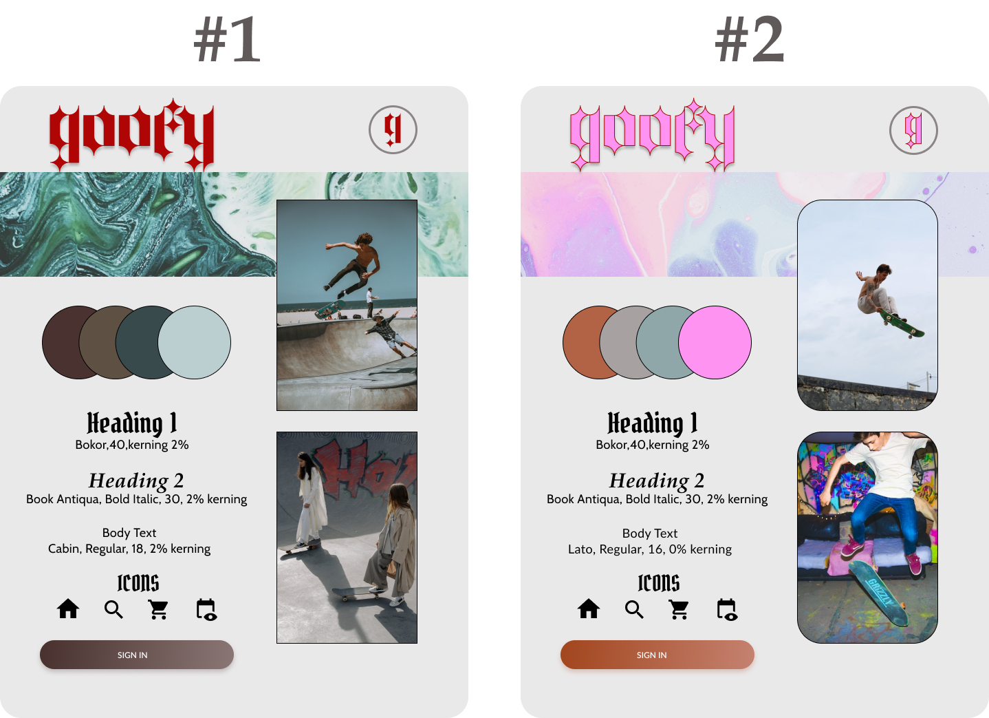
Style Tile Option #1- Rustic Skateboard Vibes-
Option #1 style tile features a more muted color palette, with earthy tones of brown and green. The design is inspired by the rough and rugged feel of skateboarding, with a more urban and street-style aesthetic. The typography has gothic nuances, with the body text being a simple sans-serif. This style tile captures the authenticity and roughness of the skateboarding lifestyle and will appeal to those looking for a more understated yet still stylish design.
Style Tile Option #2- Vibrant Skateboard Colors-
Option #2 features a bold and vibrant color palette inspired by the colors found in skateboarding culture. The colors used are bright, fun, and energetic and are mixed with earthy, muted colors for contrast purposes. The palette includes shades of orange, grey, green, and pink. The design features curved corners on all images and text boxes, giving it a friendly and approachable feel. The typography is modern and easy to read, with a mix of sans-serif and serif fonts. This style tile perfectly captures the energy and excitement of the skateboarding community.
Option #2 style tile is chosen for the final design as it aligns more with the overall vision for Goofy’s skateboarding mobile application. The bright and energetic color palette, combined with the friendly curves and modern sans-serif typography, perfectly captures the excitement and passion of the skateboarding community and is sure to attract users who are looking for an app that embodies the spirit of skateboarding culture.
Paper Wireframe Sketches- During this stage, I created rough sketches of my ideas to help visualize the layout and flow of the product. These sketches were used to communicate ideas and gather feedback.
Low-Fidelity Wireflow Frames (created in Figma)- This step involved the creation of more detailed wireframes that help to flesh out the layout and functionality of the product. At this stage, I focused on creating a basic structure for the product and establishing the flow of the user experience.
High-Fidelity Prototype- I incorporated the visual design elements and works to create an accurate representation of the final product. The high-fidelity mockups and prototypes are used to evaluate the user experience and to test the product’s functionality.
a/b testing user insights
User Experience Observation Study
A moderated observation study was conducted to evaluate the usability and design of a mobile application.
Key Findings
Sign-Up Flow:
Users found the required interactions unclear, causing confusion and friction during onboarding.
Map Feature:
Lack of clear location markers made event navigation difficult.
Search Functionality:
Absence of keyword search limited users’ ability to find and discover events.
Navigation Bar:
The bottom navigation felt disorienting, making it hard for users to locate sections quickly.
Navigation Paths:
Unnecessary back arrows and unclear routes disrupted task flow.
Outcome
The study identified clear opportunities to improve user experience by clarifying the sign-up process, enhancing map indicators, adding keyword search, simplifying navigation, and streamlining pathways.
high fidelity Mockups
Introducing the latest high-fidelity mockups for goofy’s cutting-edge skateboarding mobile application designed in Figma. These designs showcase the sleek and intuitive interface that will connect skateboarders to events and community they love. With features like local event discovery, merchandise information, and user-generated content, users can easily find and save events, connect with other skaters, and stay up-to-date on the latest in the skateboarding world. Our goal is to bring the skateboarding community together, and these mockups bring us ones step closer to making that a reality.
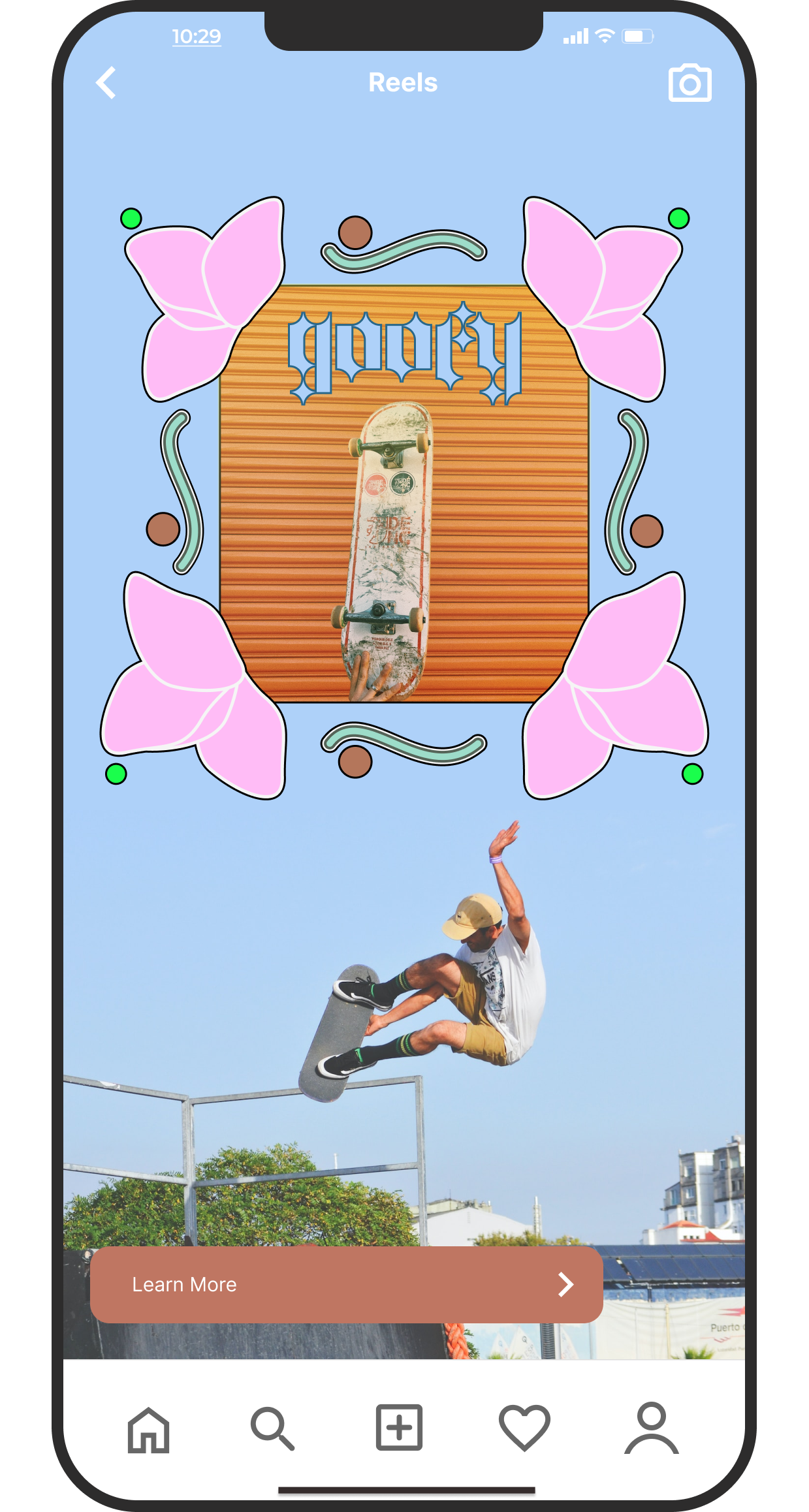
IG Reel
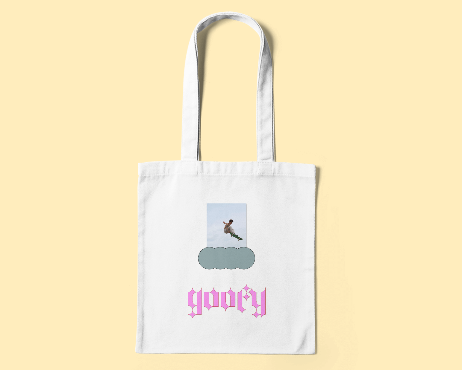
Goofy Tote Merch